
PORTFOLIO
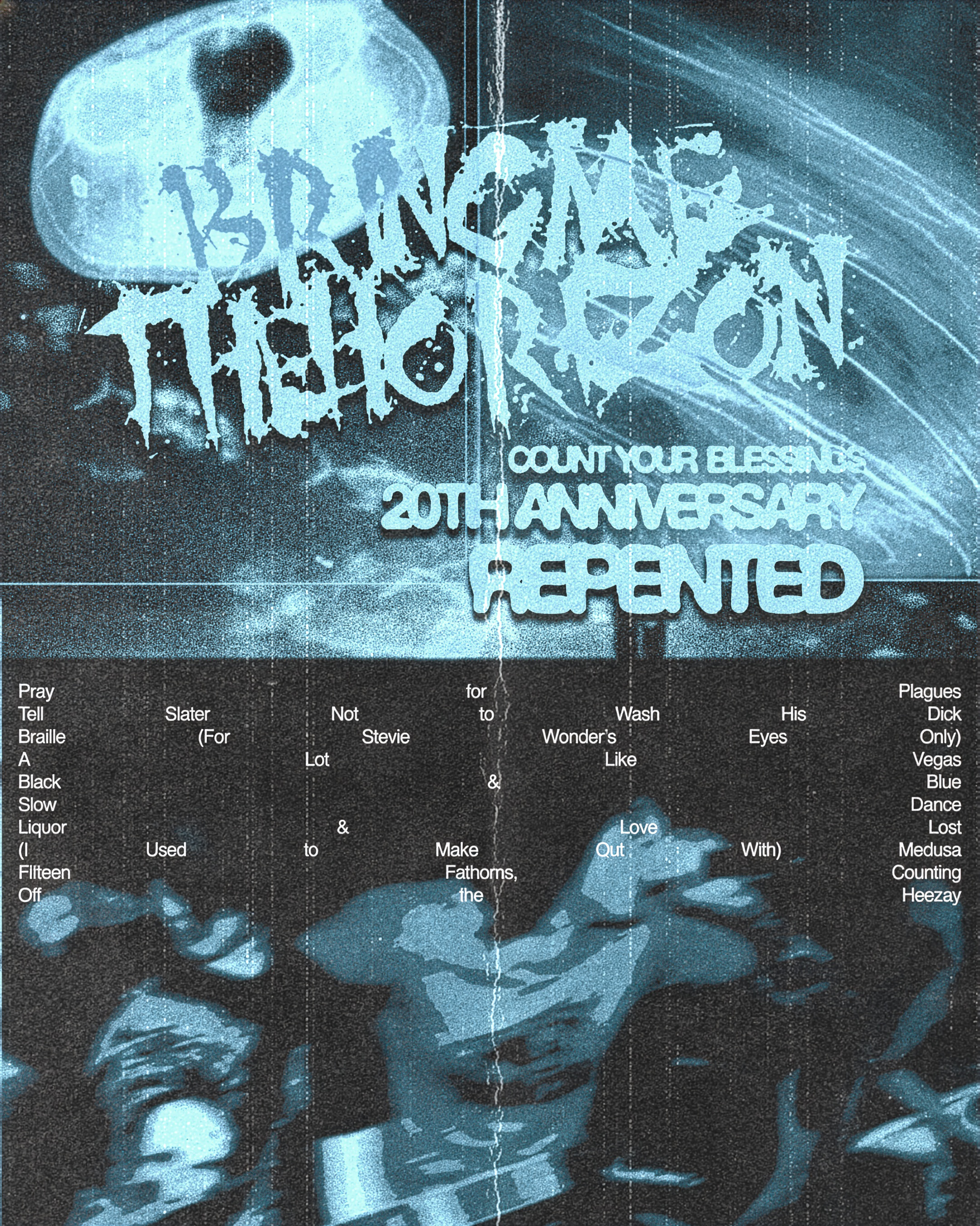
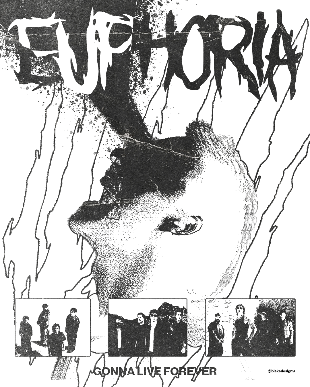
This poster was designed for the 20 year anniversary of Count Your Blessings: Repented by Count Your Blessings. Inspired by early 2000s metalcore visuals, I used distressed textures, fragmented typography and heavy grain to recreate the raw chaos of underground gig flyers and bootleg media from the era. The aim was to make the piece feel nostalgic, damaged and emotionally intense rather than clean or polished.
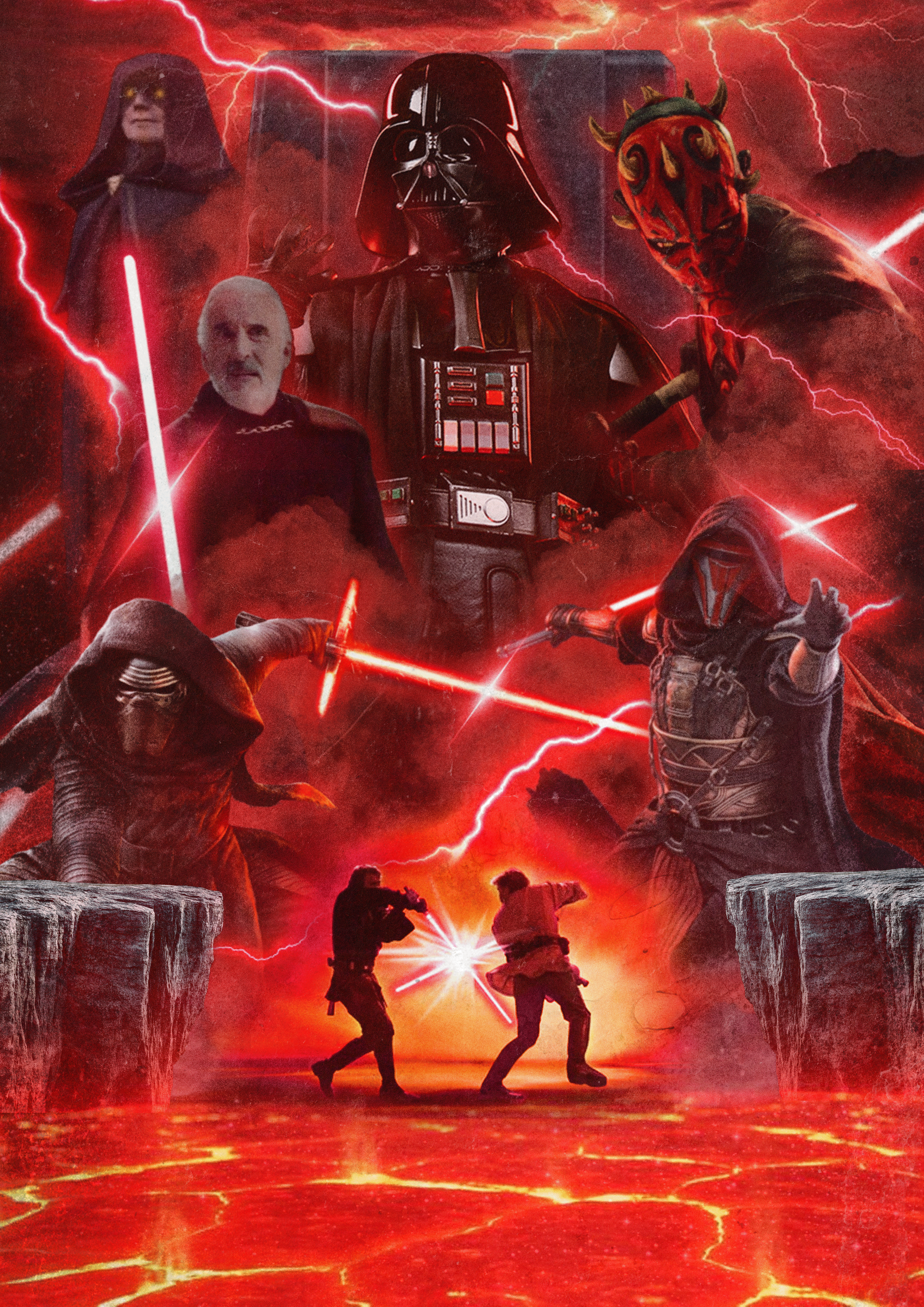
Created as part of a three-piece Star Wars Day poster collection, this design focuses on the Sith Lords of the Star Wars universe. I used dark tones, aggressive composition and cinematic imagery to reflect the power, fear and corruption associated with the dark side. The piece was inspired by classic sci-fi poster design while also incorporating a modern, high-contrast digital aesthetic.
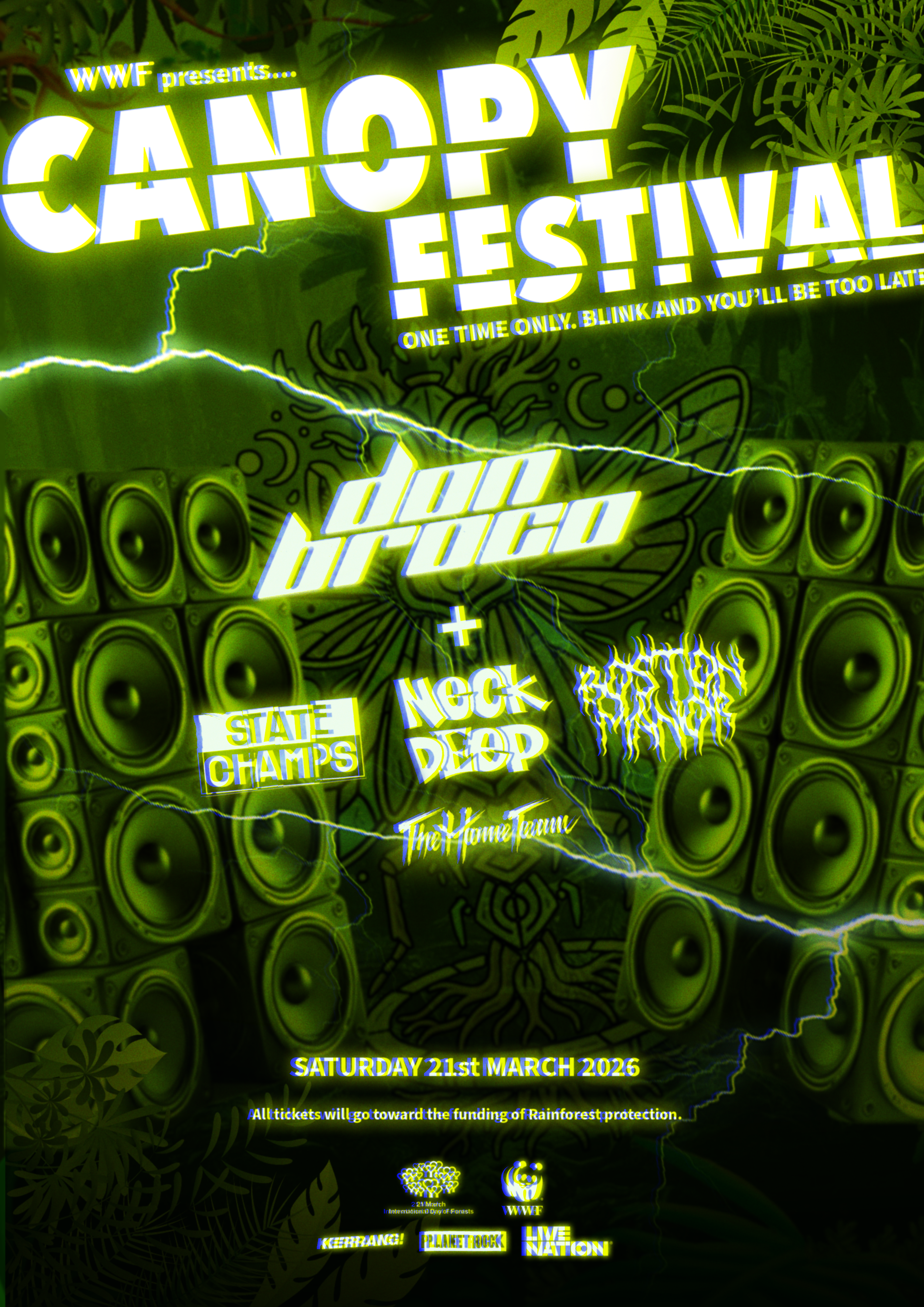
Created for Creative Conscience at university, Canopy Fest is a conceptual city-centre music festival raising awareness and funds for deforestation. The project merges alternative music culture with environmental activism, featuring merch and branding for a fictional lineup of major artists. Inspired by protest graphics and festival design, the identity is bold, disruptive, and built to stand out in an urban space, with all proceeds directed to WWF and the National Rainforest Association.
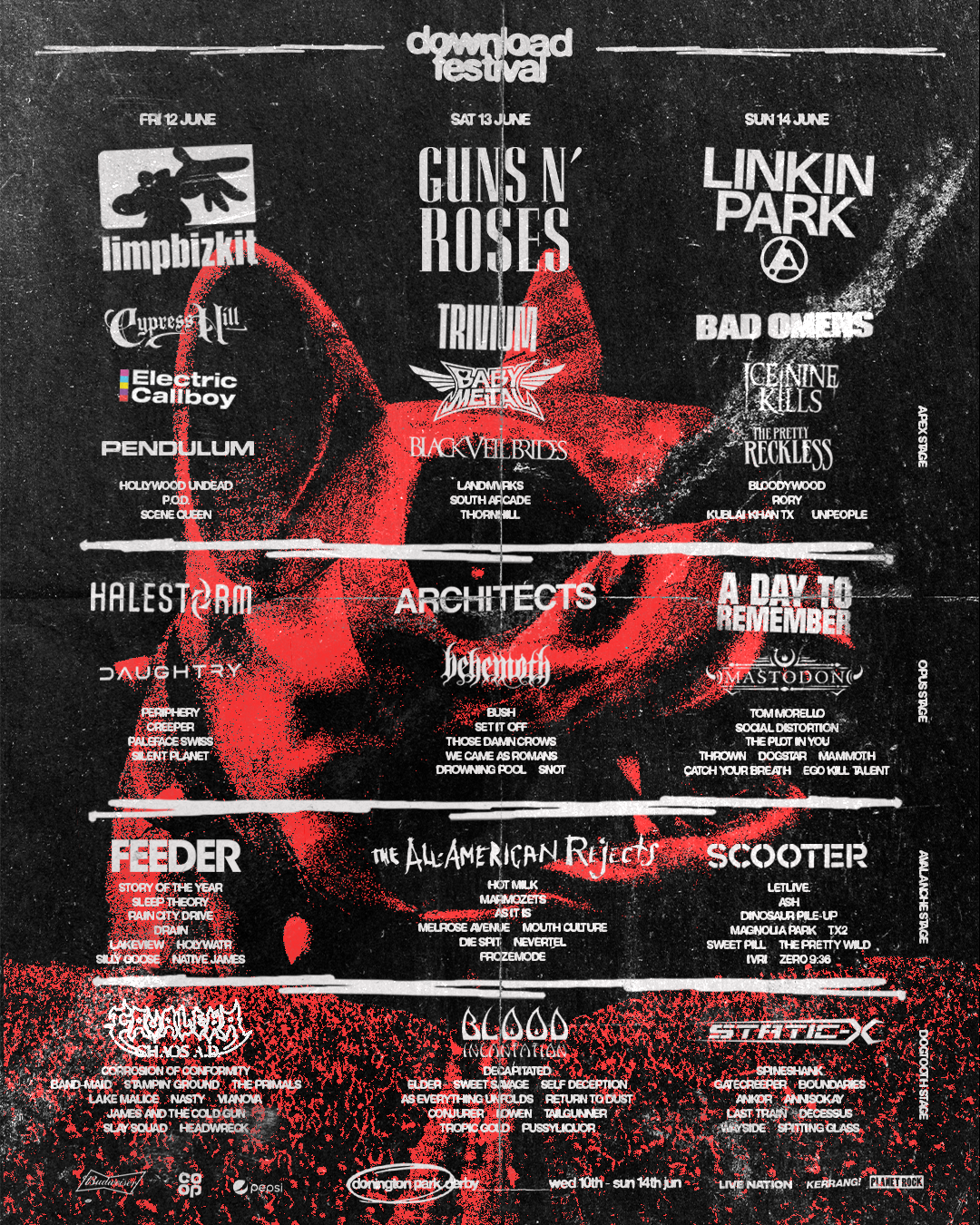
A rebrand of Download Festival 2026 created from my genuine love for the festival and everything it stands for in rock and metal culture. The concept reimagines its visual identity while staying rooted in its heavy, high-energy spirit, pushing it in a more modern and bold direction for a new era. It explores how the festival could evolve visually while still keeping that raw, loud atmosphere it’s known for.
A personal design project inspired by my love for Don Broco, where I created a series of posters for each single from their new album Nightmare Tripping. The work explores the band’s evolving sound through bold, high-impact visuals that match their energy and aesthetic. The project was especially meaningful, with Rob Damiani engaging with and reposting the designs, adding a real-world connection to the concept.
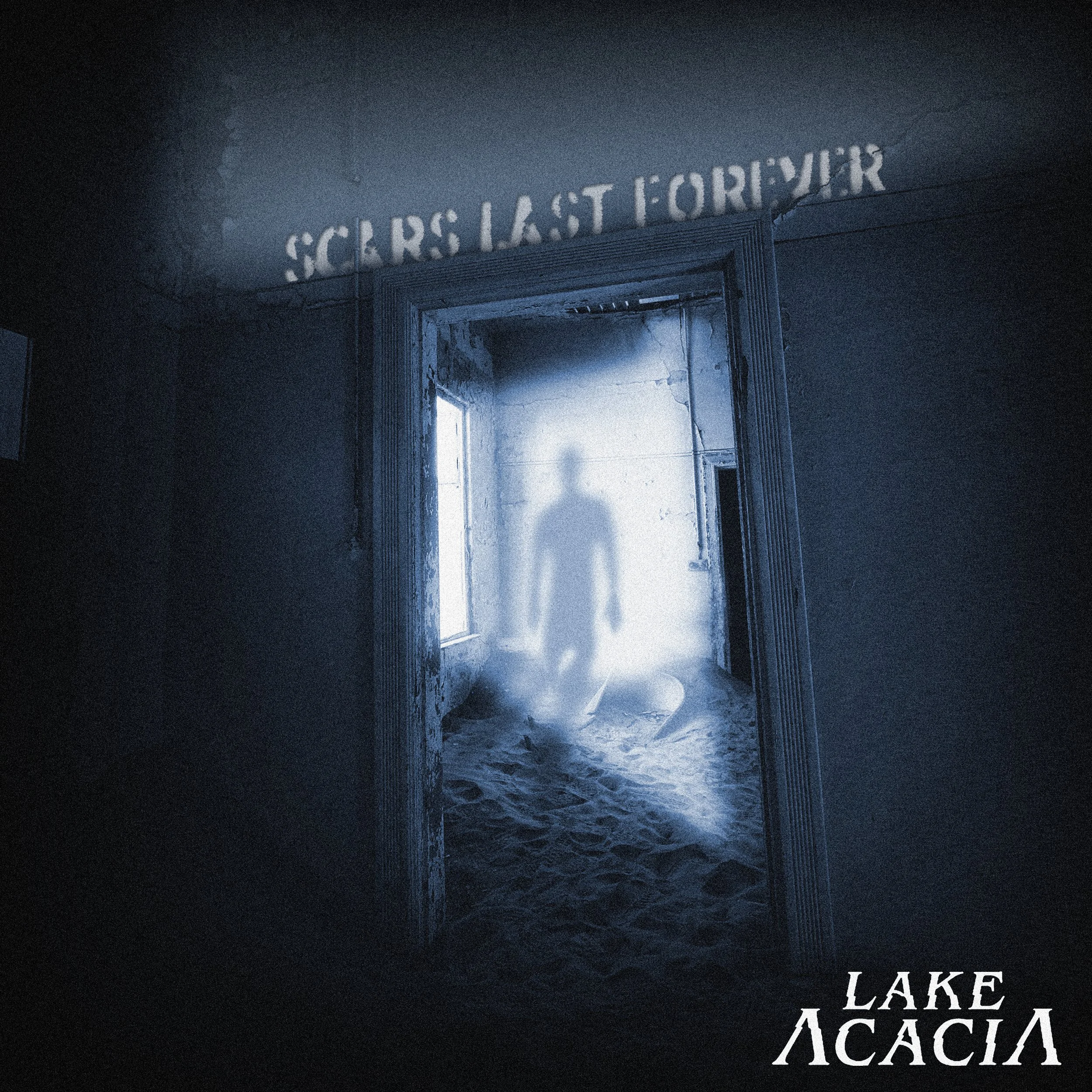
A commissioned single cover design for Lake Acacia titled Scars Last Forever. The artwork explores the frustration of witnessing injustice, feeling powerless to change it, and recognising a shared sense of responsibility or complicity within the system. These ideas are translated into a bold, emotionally charged visual that mirrors the track’s intensity while staying aligned with the band’s identity.
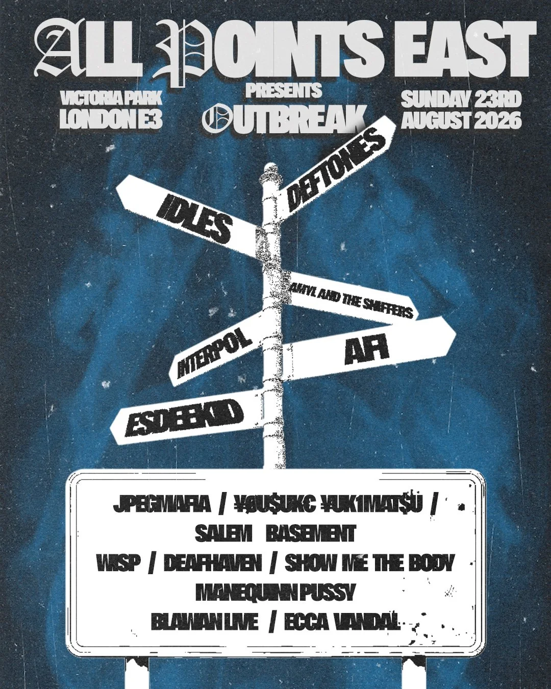
A poster redesign concept for Outbreak Fest and All Points East, reimagining the lineup layout through a directional signpost structure to reflect the variety and movement within alternative music culture. The design leans into gritty textures, distressed typography, and grunge-inspired visuals to create a raw, energetic aesthetic that matches the atmosphere of both festivals while pushing their branding in a more experimental direction.